Monday 3 August 2015

Glasstress 2015 Gotika (2)

British artist Mat Collishaw's Jewel Slot Empire, 2015, completely engaged Tom, a cathedral model with images of slot machines glowing on all its walls. I suppose one could think of religion as a game of chance.


On Murano his work, titled A Different Self, is an elaborate oversized black Murano-glass-framed video of a slightly animated version of Georges de la Tour's famous painting of Mary Magdalen in front of a mirror with a skull on her lap and a candle on the table in front of her. Unfortunately it seems to be impossible to photograph this image without getting oneself in the picture too; maybe that's intentional. 
I was very struck by two cases of bizarre marionettes by the artist Wael Shawky, titled Cabaret Crusades, The Secrets of Karbalaa, 2014. Only when we returned home did I learn that  Shawky used these marionettes to make videos of conflict that were on view at the MOMA PS 1 in New York. They are bizarre and fascinating creatures, both human and animal. And to know that the artist used them to call attention to centuries of conflict connects them with both the Gothic theme and issues of life today.


A pair of extra long glass crutches hanging from on high by Turkish artist Erdag Aksal seemed quite decorative from a distance, but the title, Crescent Disabled, 2015, and the details of grenades etched into the glass clarified its, and his purpose. 

Another aspect of the Glasstress show is the fascinating venues. The Istituto Veneto is a gorgeous building and many of its rooms have significant Murano chandeliers. Petah Coyne took advantage of one to hang long strings of glass beads from it. On the table full of glass mirrors I found a few candles, referencing the wax I usually associate with her work.

Petah Coyne, Mirror, Mirror, 2015, detail
On Murano the rugged remains of a glass factory create a completely different environment, where Maria Grazia Rosin's strange green creatures, Gothik Mechanical Meateaters, 2015, seem right at home.

There are 53 artists represented in the two-part exhibition; I have learned about a few of them in writing this essay, and shared some images. But I haven't mentioned the inventor of the video game Syberia, Benoit Sokol and his glass mastodons, or Ernst Billgren's Duck Cathedral, or the Chapmans glass skulls, The Same but in Glass, or Karen van Mednelen's eerie Siren, 2015, made from glass and crowfeathers, or Hila Amram's Still Glass, 2015, antique glass with video projections. It's a very rich and varied exhibition, the work connected both by its medium and by its connection to the concept of the Gothic seen in the contemporary world.

Glasstress 2015 Gotika (1)

For the last four Venice Biennales we have made a point of visiting Glasstress, the exhibitions initiated by Adriano Berengo, with the purpose of consecrating "glass as a noble material, one of the most innovative in contemporary art," as Berengo states in the introduction to the exhibition brochure. Each exhibition focuses on artists not usually associated with glass, and often the artists are invited to make new objects using the facilities of Murano glass studios.

This Glasstress was possibly the best, and was also one of the very best things we saw in conjunction with the Biennale. The show is in two parts, one at the Istituto Veneto di Scienze, Lettere ed Arti in the Palazzo Franchetti, very near the Accademia Bridge on the San Marco side, and the other at the Fondazione Berengo on Murano.
Istituto staircase with Penny Byrne, Hurt Locker, 2015, at right
In this instance I would recommend the Istituto half much more enthusiastically than the Murano one, unless you really want to see the camel (Koen van Mechelen has participated in all the Glasstress exhibitions, with his ecologically based installations and objects, this time expanding from chickens to diversity in plants and animals.). Other times we have found the Murano section particularly engaging.

The Gothic theme was enhanced by loans of Gothic and neo-Gothic objects, most of them in glass, rock crystal and gold, from the State Hermitage Museum in St. Petersburg, precious objects displayed in cases along the walls, but without identifying labels, as far as I could tell.

Glass and metal objects from the Hermitage, Glasstress
 I was drawn, and still am drawn, but a section of the introductory label, where curator Dimitri Ozerkov compares the "magic rituals" of contemporary daily routines - checking email, charging devices, deleting spam, online chatting, instagraming, tweeting, gaming and reading news online - to the laborious tasks of medieval monks copying manuscripts. He suggests that we see the internet as comparable to a medieval amulet to ward off evil. And with that he celebrates the craft involved in creating objects for this exhibition.

Glasstress has always involved contemporary artists not usually know for their work in glass. This year a few of those I know best are Tony Cragg, Olafur Eliasson, Ilya and Emilia Kabakov, Jaume Plensa, Petah Coyne, Qiu Zhijie, Jake and Dinos Chapman, Bernar Venet, Joana Vasconcelos, Mimmo Paladino, and Zhang Huan. But those by artists I did not know were at least equally engaging.

Although very few people read my blog, I find writing it a great learning opportunity. The Glasstress exhibition was fascinating in and of itself, but in order to write about the objects, I do a certain amount of research and am amazed at what I find about the artists whose work interests me, but who are unfamiliar. It's a great learning opportunity, and I try to share it through images and links. These artists are amazing.

"Gothic" suggests stained glass, and several works capitalized on that idea. At first I found Belgian artist Wim Delvoye's stained glass images of the muses Melpomene and Calliope, 2001/2, merely interesting. Then I looked closer and saw the x-ray images that make up the two figures, combining multiple body parts, chains, rings, keys and other elements. Calliope, on the right, is multiply bound, so that the windows call to mind political issues rather than religious contemplation. And I learned that Delvoye specializes in disturbing, challenging art.

Wim Delvoye, Melpomene, 2001/2, detail
 
In a similar vein, the lovely classical-looking chandelier by Chinese artist Song Dong turns out to be a bit less harmless. Titled Glass Big Brother, 2015, it is composed of glass surveillance cameras.

Song Dong, Glass Big Brother, 2015
American Bart Dorsa  (He has lived in Moscow for several years and his grandfather invented Eggo waffles.) showed fragmented hollow white sculptures of partial bodies in a totally darkened space. While I was not particularly engaged by his exhibition of photogaphs of a young woman named Katya as a collateral event of the 2013 Biennale, these glass sculptures were more evocative. In the label he associates them with a sculpture of Joan of Arc he discovered in Notre Dame in Paris.
Bart Dorsa, Relic Glass #1 and #2, detail

)More on next entry)

Sunday 7 June 2015

A late spring day at the farm - Wednesday

For some reason today seemed like an especially characteristic day at the farm and I’m more aware than usual how different this is from the other places I’ve lived (suburban New Jersey, New York, New Haven, Austin, even Lawrence itself).  All the rain we've had has limited our ability to take care of the apple trees, especially clearing the grass away from them. I figured it was dry enough to weedwhack around 11 in the morning and I got about 20 trees done. It was cloudy and I did feel a few raindrops. Then I noticed that Thunder was hanging around, looking at me expectantly and it started to rain a little more. Thunder the dog is terrified of thunder and lightning, so I paid attention to his attention to me. In a pause of the weedwhacker ( which is very loud and I wear big ear plugs), I heard a bit of thunder, so we all three, Thunder, Rosie, and I, hurried toward the house. By the time we got there it was pouring.
 
This afternoon the new birdbath came. The old one has crumbled and is leaning against the side of the deck. The new one is colored glass on a metal stand and I like it a lot, but I’m afraid a good wind, or an eager raccoon, will topple it right over. So I’m figuring out ways to fix that.
 
After dinner, I suggested that we go out and check on the cherries, and Tom wanted me to take my pole saw and cut off some dead branches on the cherry tree. I did that, but a lot of the cherries were ripe, so we picked about 6 pounds of sour cherries, for jam and cobbler. I’ll need to be pitting them real soon. And there are hundreds of unripe and nearly ripe cherries. We also picked about 7 sweet cherries; that tree is new and taking a while to produce anything. But they are sweet cherries, which I love.
About four pounds of sour cherries
So for dessert I decided to have my ice cream on the deck. We sat out there and I was noticing how huge the sky is here and how the thin clouds are just calmly wafting by in it. But the hummingbirds were buzzing around and I realized that all three feeders were empty, so I had to make some nectar and fill the feeders. Earlier we saw a house finch feeding a juvenile house finch on the deck railing.
 

To end the day, I fed the dogs their treats just when the coyotes started to howl. I heard the high pitched ones coming from around the barn and the lower pitched, stronger ones, coming from just past the fence line of the back yard. They really seemed close, so maybe that’s why the raccoon doesn’t seem to have been around the past few days. They drive Rosie crazy with barking.

Since Wednesday we've picked, and I've pitted, enough cherries for four cobblers and made 5 jars of sour cherry jam. More to come. 

Sunday 17 May 2015

At the Time of Klimt: The Vienna Secession

On the last of our days in Paris we finally went into Notre Dame, which we had been looking at from our hotel room window all week. And for the first time I got to see the tombs and the structure at St. Denis, which was actually a lot easier to get to than I had imagined.

After lunch we wandered back to the center of Paris and decided that we should go to the Pinacotheque de Paris (which I had never heard of) and see the new exhibition of Gustav Klimt and the Vienna Secession. Because we go to the Neue Galerie in New York quite often, we weren't really sure if we needed to bother with this exhibition, imagining that it might be similar to the offerings there. But it had some stunning objects and provided a broad view, sort of in vignettes, or aspects of both the politics and the art of early 20th-century Vienna.

The exhibition began with an orientation to the Austro-Hungarian Empire and Vienna's position in Central Europe around the turn of the century as a cultural hub of great diversity. Portraits of the Emperor Franz Joseph as a rather simpering young man and a substantial old man spanned his extraordinarily long rule from 1848 to 1916. The exhibition also acknowledges that Paris was still an important venue for artists and many of the Viennese artists made a point of going there.

After a couple of informative galleries we were surprised and impressed to find Klimt's Beethoven Frieze, an amazing and beautiful work of 1901, made for the Vienna Secession building as part of a Gesamtkunstwerk celebrating Beethoven. The floating figures above completely white walls, followed by various figures either simply outlined or decked out in gold and elaborate patterns are spectacular. Seeing that frieze convinced us that we had made the right decision to see the exhibition.

The actual organization of the exhibition, each room representing a theme, was ultimately not completely coherent, since the themes varied from historical context to subject matter to the various media of Secession artists, and I'm not sure we came away with a better understanding of the work of this group of artists, although we certainly saw work by unfamiliar painters who were active at the time. I was not convinced that two rooms representing the "Femme Fatale" and the "Femme Fragile," for example, really made the point they intended.

On the other hand, Klimt's paintings of Salome and Judith are captivating, gorgeous in their gold and patterning and a bit scary in the seductive expression of Judith and the clawlike hands of Salome. I went back to that room a couple of times. While I usually think of Klimt as an artist of geometric patterns and gold leaf, these paintings and others of people had the power to frighten in a very personal way.

A room of portraits provided the best sense of the breadth of Klimt's ability. A female portrait of 1894 could have been any society portrait, a standing woman turned with her face in profile, wearing a fashionable dress and with delicately modeled features and a calm expression.  Head of a Young Woman, 1898, is a soft-focus image of only a face against a black background, staring directly at the viewer with a disconcerting intensity.

The exhibition includes architecture, sculpture, furniture and painting by other members of the Secession, including Kolomon Moser, Carl Moll, Oskar Kokoschka, Egon Schiele, Michael Powolny, Otto Wagner, Adolf Loos and many others whose works all merited attention. But the star of the show was definitely Klimt.

Wednesday 6 May 2015

Velazquez at the Palais Royale

In Paris we saw quite a few exhibitions, visiting two museums a day for 6 1/2 days. We never went to the Louvre, the Musee d'Orsay, or most of the museums near the Louvre.The Velazquez exhibition at the Grand Palais had just opened and I thought we needed to go, since he is such an important artist, but I didn't find it nearly as exciting as just seeing the Velazquez paintings at the Prado, an unforgettable, powerfully moving experience. At the same time I was sad that the lines for the Jean Paul Gaultier exhibition were far longer. The exhibition, organized chronologically, seemed to have a lot of portraits and a lot of work by his followers, which is fine, except that they weren't necessarily all that exciting. (On the other hand I was very impressed with the work of his teacher Francisco Pacheco.) The Rokeby Venus (London, National Gallery) was there, and a selection of works from the Prado, including Baltasar Carlos on his Pony, 1634-35 and The Forge of Vulcan, ca. 1630, all fabulous paintings. For the press release that explains the organizers' purpose, click here.

Among the paintings that caught my attention, I was surprised that so many were actually familiar since I had seen them in American collections. The portrait of the young Baltasar Carlos and his Dwarf of 1631, for example is from the Museum of Fine Arts, Boston. Others were from Cleveland, Chicago, Fort Worth and other American collections. However I missed the Velazquez that probably attracted me in him in the first place, the portrait of Philip IV from the Frick Collection. I always love the experience of looking at the silvered lace of Philips sleeve and robe and watching it turn into daubs of paint as I get close to the painting. Velazquez painted Philip IV many times, but this one always seems particularly flattering to him, despite his unappealing Hapsburg features. The exhibition included a pretty good painting by Juan de Pareja, Velazquez's slave who studied with him and also became a painter, but not the famous portrait of Juan from the Met.

Of the many portraits in the exhibition, that of Pope Innocent X is, of course, stunning, as it is considered one of the great portraits of all time. The artist captured the complexity of the elderly pope's emotions so that looking at it for a while one sees the full range of his character. And there is that virtuoso brushwork.

Among the masterworks it seemed that there were quite a few portraits that did not sing with the individuality of the sitter or the virtuoso brushwork of the master, and then there were also works by those who imitated Velazquez, skilled artists who captured the appearance of their subject, but perhaps not his or her essence.

I thought that if one lives in Europe this exhibition is a fabulous way to see a lot of Velazquez works from the diverse and distant cities in the United States, and if one hasn't been to the Prado or seen many of these works in other places, it's a fine introduction to Velazquez's work. At the same time, he was a brilliant artist, but not every one of his paintings is brilliant and some of those are in this exhibition.

Wednesday 29 April 2015

The Musee Jacquemart-Andre and its Exhibition Giotto to Caravaggio: The Passions of Roberto Longhi

It appears that I had never been to the Musee Jacquemart-Andre despite the fact that it houses not only a significant collection of Italian Renaissance painting and sculpture but also lots of medals, plaquettes and bronze statuettes of the Renaissance, all subjects I studied much in the past. I had diligently used the catalogue of its medals and plaquettes as references my own publications, but am sure I would remember the building if I had been there. It is a splendid museum, built in the late 19th century as a residence, with wonderful rocaille decoration, a gorgeous conservatory and extensive galleries. I suspect it as a model for the Frick Collection in New York, although it is somewhat grander. We were there on Easter and the beautiful café was full or we would have lingered longer.

Aside from the masterpieces of Renaissance art in the permanent collection and the spectacular eighteenth-century works - including a Tiepolo fresco of the Arrival of Henry III in Italy, purchased from the Villa Contarini in Italy in 1893 and transported to Paris to decorate the staircase, with the ceiling from the same cycle, which adorns the café ceiling - the Museum offers exhibitions.

At first when I saw the publicity for the exhibition in the Metro, I was not enticed. "Giotto to Caravaggio" sounds like a generic exhibition drawn from some private or public collection. However the subtitle referred to the art historian Roberto Longhi, who died in 1970 and I became curious as to how a museum might create an exhibition around an art historian. The show is a fascinating entrée into the world of connoisseurship and the history of how the reputations of works of art can be changed, in this case by the enthusiasm and dedication of a single scholar. The link above goes to the exhibition website and some very helpful accompanying information in English.

Books on art historians and historiography have proliferated in the past couple of decades, but I don't recall exhibitions celebrating the discoveries, connoisseurship and reinterpretations of art historians. I imagine that the fact that there is a Longhi Foundation in Florence that houses his collection of mostly Caravaggist paintings may have been an incentive to this project. In any event, the objects are absolutely wonderful and the information gives one a sense of how Longhi during his lifetime actually changed how we understand the history of Italian Renaissance and baroque art. I wonder what other art historians might merit the same attention.

The exhibition celebrates Longhi for reviving, or creating interest in Piero della Francesca, Caravaggio and a host of Ferrarese painters (who are still actually relatively unknown - Cosimo Tura, Francesco del Cossa, Dosso Dossi) and for his new discoveries about Giotto and Masaccio. His promotion of the artists influenced by style of Caravaggio - the Caravaggisti painters - is also significantly represented.  Having studied art history beginning shortly before Longhi's death, I was unaware that their reputations had needed reviving; they were central to the curriculum by the time I was taking courses.  And the exhibition, of a rather small and manageable size, contains several wonderful works of art that one could study at length in comfort and with informative educational materials around them.

I was first struck by a Caravaggio Sleeping Cupid, 1608 from the Palazzo Pitti, not completely different in pose from antique and Renaissance Cupids, but I became fascinated that the flesh on his chest was uneven with cellulite, a disturbingly realistic detail that only Caravaggio would have emphasized in the early 17th century. Of course the strong contrast of light and shade modeling his figure, the highlights on the edges of his wings and the dark background also identified the artist. Many other works in the exhibition were by Caravaggio or his imitators and followers, and one could compare the master with his imitators and with those he inspired, such as Jusepe de Rivera. Longhi is credited with reviving Caravaggio's long reputation and with documenting his widespread influence in 17th century Europe.

In another room a small Masaccio Madonna and Child from the Uffizi of 1426-27, caught my eye. Longhi was the first to attribute this charming small work to Masaccio, in 1950. In 1940 Longhi had published Fatti di Masolino e Masaccio, in which he distinguished their styles and identified Masaccio as a key figure in the foundation of the Renaissance style.  Masaccio's paintings are rare and this small example glows with the red and blue of the Madonna's robes. Her face is softly modeled as she gravely looks down at the infant Christ, tickling his chin with two fingers (also interpreted as a gesture of benediction) as he giggles slightly and clasps her arm. It seems very simple and straightforward, but the three-quarters turn of her body, suggestion of a light source, human gestures and soft handling of flesh were enormously innovative at the time.

The next work worth some time is a pair of Saints, St. John the Evangelist and St. Lawrence, attributed to Giotto by Longhi in 1930, then disputed and re-attributed to Giotto in 2013. One can understand the dispute, since the St. Lawrence is not what I would expect from Giotto; it's somehow clunky and stiff, either poorly restored or just clumsily designed. But the St. John is wonderful, with the beginnings of individuality, the sense of volumes, and even the handling of the eyes and ears one sees in Giotto's work.

Longhi published several works on Piero della Francesca, including a 1927 monograph on this great painter and mathematician of the mid-15th century. It is hard to imagine that Piero was not considered one of the major painters of the Renaissance (even the painter of the small masterpiece featured in several Downton Abbey episodes) until Longhi revived his reputation. The exhibition includes St. Jerome and a Donor (ca. 1460, Venice Galleria dell' Accademia) by Piero, a small painting that demonstrates Piero's luminous light effects, carefully structured compositions including landscape, and interest in geometry.

Longhi had wide ranging interests and friendships. He was a fan of Courbet and impressionism, collected Giorgio Morandi's work, and was a friend of the avant-garde film director and poet Pier Paolo Pasolini. Longhi wrote on the importance of studying works of art in their full context, not just in relation to other paintings but to history, biography and broader culture. This was a strikingly informative exhibition that opened my eyes to some wonderful objects and to the evolving nature of art history through the work of someone I had only known by a name.

Friday 24 April 2015

Keys to a passion: Fondation Louis Vuitton


One of the reasons we went to Paris was to see the Fondation Louis Vuitton and its new Frank Gehry Building. We were fascinated by the building, as everyone else has been. I loved that Gehry has truly separated the “sails” that cover the building from its actual structure, that there are many levels under those sails to explore outdoors, and that the galleries indoors are rectangular with straight vertical walls. I also like the sculptural shape of the interior structure as you see it from outside, contradicting the regularity of the interior spaces. I could not photograph it from above or the long side, so what I can offer are details of the complexity of the structure.


The building structure makes some sense, it seems almost infinitely varied, and it is possible to install most kinds of art appropriately in the galleries. A couple of the galleries have wonderful high skylights, where sunlight can enter but is unlikely to hit works of art directly.

We explored the building and its permanent collection exhibits – a quirky variety of generations and media. A video by Akram Zaatari, Tomorrow Everything will be Alright, 2010 seemed familiar and we realized that we had seen it two years ago at the Museo de Arte Contemporaneo (MUAC) in Mexico City. Given the political nature of much of his work, choosing this one for a collection seems a bit eccentric, although its gay theme and easy accessibility, at least to an English reader, may be considerable assets. Giacometti and Ellsworth Kelly among artists I find more difficult: Isa Genzken, Annette Messager, and other contemporaries - Maurizio Cattelan, Thomas Schutte, Adrian Villar Rojas.
 
Wandering downstairs, partly intending to get a closer look at the water feature, we found the exhibition, Keys to a passion, which coincidentally had opened the day before. This exhibition has already been widely discussed just because of the rarity and high value of the loans, important treasures from major international museums. The atrium was set up for crowds, but there were very few people. Guides handed us a booklet of all the exhibition labels in English, a wonderful asset that enables one to read the label and look at the art at the same time, without having to wait for the nearsighted person or people in front to finish. And you can re-read them later.
 
It took us a while to realize how stunning the exhibition is. Organized on four disparate and inconsistent themes: subjective expressionism, contemplative, Popist (as in Pop, not the Pope), and music, the works, about 60 objects by 29 artists, are generously spaced in six rooms. The guide says they "established the foundations of modernity.... By breaking rules, these irreducibly singular works have become touchstones in the history of art." Well, I think maybe some of them more than others, although each object merits the substantial examination and contemplation the organizers hope for.
 
Indeed the works are masterpieces, but perhaps because we had no publicity to set us up for it, we didn't feel like we were in a textbook of masterpieces. Not everything was completely familiar and I was most taken by Nolde, Hodler and Mondrian landscapes, a Malevich figure, a gorgeous red Rothko, and the two Franz Kupkas. Of course, the Kandinskys from the Edward R. Campbell atrium, Matisse's Dance, and the Munch Scream were obviously major loans. And, finally I wondered, and still wonder, how the curators chose works by three other artists. First were five self-portraits by the wonderful Finnish artist Helene Schjerfbeck, whose major retrospective we saw in Helsinki three years ago. They are stunning and hold their own with the Munch and Otto Dix's Portrait of the Dancer Anita Berber, 1925 (Tom's favorite) nearby. But her expressionism without any of the standard Germans seems a bit odd.
 
Similarly, in the "contemplative" section, near the Noldes and Mondrians were four very similar paintings of Lake Keitele by the Finnish artist Akseli Gallen-Kallela. I was engaged by the slight variations in the stylized interpretations of this series, impressed that the four paintings had been brought together from at least three disparate collections, and curious as to what inspired these particular works to join the exhibition, especially since they are quite uncharacteristic of his oeuvre, which we had the chance to see in a major exhibition in Dusseldorf in 2012. Perhaps the Vuitton curator made the same rounds we did of Finnish artists in 2012. And I wondered if the artist was continuing to work out a composition, as the label suggests, or if he found a popular subject and was repeating it for additional sales. The paintings certainly fit into the context of the room, but seem unlikely as foundation works for later art, especially when one of them was acquired by the National Gallery in London only in 1999 and become "iconic" only since then.
 
Then, in the section titled "Popist," which I initially believed must have to do with the Catholic religion, I was rather puzzled at Robert Delauney's inclusion, since I think of him more for his abstraction and color than for his popular subjects. But the real amusement came from Francis Picabia's cavorting naked women with dogs that seemed to come from exactly the same girlie aesthetic as the Jeff Koons paintings I had rather dismissed the day before. These Picabias were as unlikely in their present company as the Finnish artists in theirs, and again I wondered what the curatorial impetus was for including them as sources of the "Pop" in modern art. They are also quite different from most of Picabia's work, as is evident if you search Picabia images.
 
So I am curious and puzzled by some of the curatorial choices in this exhibition, which nonetheless is one of the three really memorable, important, and innovative shows we saw in Paris.


Thursday 23 April 2015

Jeff Koons at the Pompidou Center

In Paris earlier this month we made a point of visiting the Jeff Koons exhibition at the Pompidou Center. Koons is a puzzlement to me. I want to be able to dismiss him, as several critics do, as vacuous and pandering to collecting fashion, but somehow that seems to dismiss the fact that Koons is so popular with the general public, with collectors, and with some critics. His commercialism and superficiality speak to an aspect of contemporary American culture. But it’s a little embarrassing to think that we embrace that superficiality as eagerly and fully as the market for his work would indicate.

So I wanted to see how the work was presented and interpreted by the exhibition curators. They provided some excellent context that helped me to see what inspired the objects and to understand Koons’s process. But in the end I still don’t feel convinced that I should value his art emotionally or intellectually, because it doesn’t mean much to me, even if it does, sadly, speak to contemporary culture and is occasionally amusing.

I was surprised that the first few objects were simply store-bought inflatable flowers and a bunny set against mirrors. By using mirrors Koons refers to Robert Smithson’s mirror works, although Smithson uses the mirror corner to enlarge or modify the object - usually a small earthwork - set against it. Then Koons set teapots and vacuum cleaners against florescent bulbs, the “found” objects inspired by Marcel Duchamp and Dada and the lights perhaps by Dan Flavin’s florescent works. While the labels indicate that the vacuum cleaners will remain pristine in their plexi boxes, they will eventually deteriorate. Personally I do not find the forms of the teapots and vacuum cleaners to have the design sense or the wry humor of Duchamp’s readymades. Duchamp makes you look at everyday objects aesthetically and see them as sculpture or design: not so much with Koons’s vacuum cleaners.

The first Koons I ever saw was the floating basketball, which left me cold many years ago. We did not see this in Paris, but it is in the catalog, something about equilibrium, in a series about rising and falling basketball stars and bronze aqualungs and lifeboats, perhaps deriving from trompe l’oeil sculptures of the 1970s.

I was very interested in the section where Koons enlarged alcohol ads to monumental size because he says he was interested in how the ads became more abstract as the neighborhood became wealthier. However, although I imagined that it was there, I couldn’t actually see anything about that in the ads exhibited – they were just enlarged booze ads, as Richard Prince had done with tobacco ads.

I thought the 1986 stainless steel model train that actually contained bourbon was interesting (had no idea the artist's proof had sold for $33,765,000 in 2014), but couldn’t really figure much out from it, except that it seemed to reproduce a commercial set of Jim Bean bottles.  I suppose alcohol ads and bottles are always fun. This was followed by multiple stainless steel casts of baroque portrait busts and other sculptures. The labels address the fact that stainless steel is a “proletarian” material and so the busts suggest “fake luxury.” They are shiny and cold and pretty boring replicas. Among them was a stainless steel reproduction of an inflatable rabbit, which the label says ‘transforms this inflatable disposable object into a durable and precious one,’ (albeit of “proletarian” material). Even when the curator offers several interpretations, it still looks to me like a cute trick.
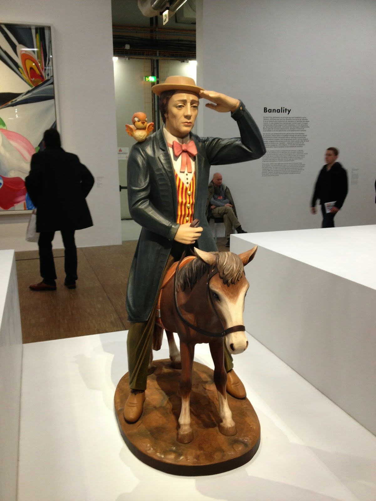
Buster Keaton, 1988
Polychromed wood (Ed. 3/3)
Sonnabend Collection
and Antonio Homem
 
We used to have a small collection of ANRI figurines, which I sold on Ebay several years ago for more money than I’d expected. Koons’s Banality series of giant versions of cutsey carvings reminds me of those figures. Is making collectibles giant a way of giving them aesthetic value? Or is it pandering to the lowest common denominator? Koons’s comments seem to co-opt the condescension I feel toward these really, really stupid objects. Following these with the vapid pretty-faced images of Koons himself having sex and/or sculpted heroically in marble starts to make my stomach ache. On the other hand, I did sort of want the blue glass version of him having sex for our glass collection.

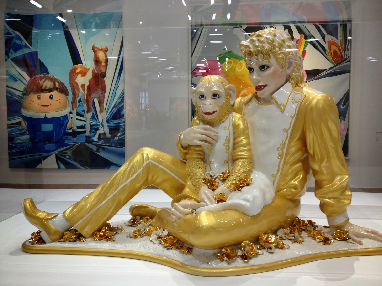
Michael Jackson and Bubbles, 1988
Porcelain (Ed. 1/3)
Private Collecton
Then there’s Michael Jackson and Bubbles, a huge gilt porcelain sculpture copied from a photograph, made by assistants in a sophisticated technique in an edition of three. Having little personal interest in Michael Jackson, I still find this entertaining in its lush surfaces and Pop sources., not to mention that it has become some kind of icon of both Jackson and Koons.

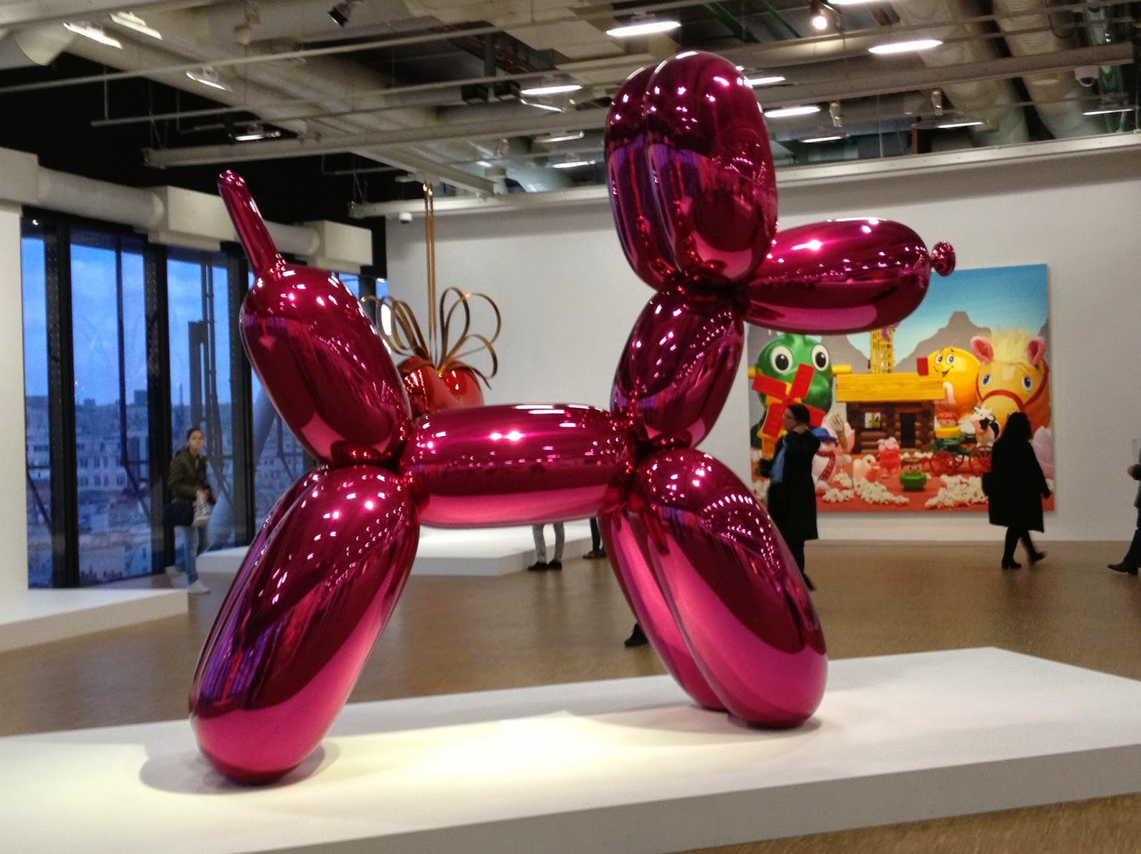
Balloon Dog (Magenta), 1994-2000
Stainless steel, clear polyester, transparent varnish
1 of 5 unique versions
Pinault Collection
I also loved the giant topiary Puppy when we saw it in front of the Guggenheim Bilbao in 1999. And I can’t help but smile at the giant Balloon Dog that exists in five versions. It’s shiny, looks like a child’s toy, and contrasts the hardness of steel with the fragility of balloons. I think it’s fun and a kind of extension of Pop art, but I can’t take it very seriously. What does that mean? I smile when I see these works and that’s fine, but they don’t cause me to think or feel anything more profound than that initial response. Amusement and delight are valid responses to a work of art, though and more than a lot of art evokes from me.

About this time in the exhibition I learned that all of Koons’s paintings are executed by assistants following a paint-by-numbers system to assure conformity to his requirements. And I find minimal evidence that he draws or paints or sculpts himself. Andy Warhol’s studio concept is fully realized in Koons’s production system, where the ideas are his (I must assume) but the execution is by others, as in a factory.  The effect of this painting system is surprisingly photo-realistic. My snapshot of a detail of a painting looks to me like the actual plastic toy sculpture. And the sculptures are meticulously crafted by the fabricators he employs.

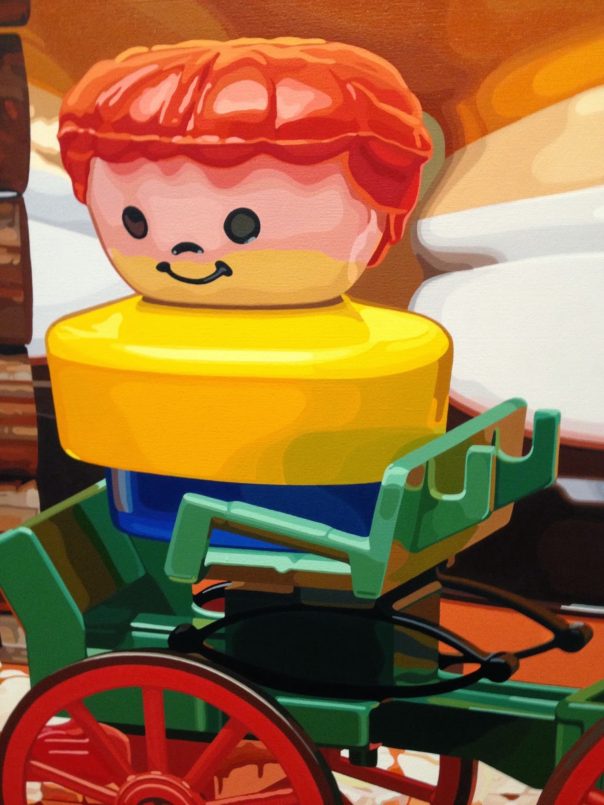
Shelter, 1996-98, detail
Oil on canvas
The Rachel and Jean-Pierre Lehmann Collection

There follow quite a few paintings in various series that combine multiple commercial sources (“product packaging, advertisements, and magazine photography,” as well as cartoons and images of toys) in collages that are then significantly enlarged and painted by assistants. They remind me of Frank Stella’s paintings that employed computer imaging; here Stella’s smoke patterns are replaced by fishnet stockings.

More recent editions in the exhibition were Antiquity, monumental reproductions of well-known sculptures in brightly colored stainless steel, so shiny that they are difficult to see and in colors that make me grit my teeth. In fact one effect of all the detailed stainless-steel sculptures is that they are very difficult to see because of the hard reflectiveness of the medium. These were followed by Gazing Ball, mostly oversize plaster replicas of famous classical sculptures,  each holding a blue gazing ball, combining two garden-sculpture types.  (The addition of a mailbox with a gazing ball might be intended to clue me that the works are about things one would fine outdoors.) It’s a way of transforming ancient treasures into contemporary kitsch, so the collector can have it both ways, I suppose, i.e. the ancient object and a spoof of antiquity, but not a garden sculpture, since the plaster would not survive well out-of-doors.
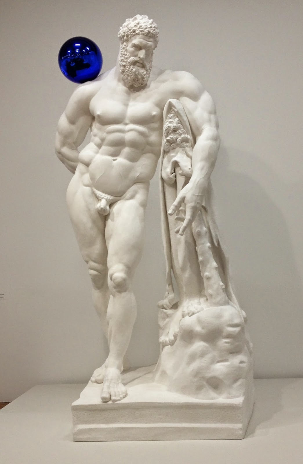
Gazing Ball (Farnese Hercules), 2013
Plaster and glass (Ed. 3/3)
Private Collection


Wednesday 15 April 2015

Sarah Burt

My friend Sarah Burt died on Tuesday April 7 after about 5 months struggling with pancreatic cancer. I’m glad I saw her in early March, when she was still feeling relatively good and we could have the endless conversations we, and all her friends, have always enjoyed with her. Sarah had a long career, first as a journalist, then as an art historian, but at the age of 62 she was just coming into her own as a scholar and curator and when I saw her in August, before she was diagnosed, I was really impressed with her accomplishments and her confidence about her work as a museum curator. She was always a brilliant scholar. You would tell Sarah about something that interested you that she had never heard of and the next time you saw her she could tell you everything about it. And she had ideas!  About artists, about exhibitions, about the way art works.

Sarah started graduate school at the University of Kansas in the Japanese art program, but about the time she completed the masters she realized that the Japanese language was going to be too much of a challenge and she switched to American art. As I recall, she worked on William Keith, and on the Swedenborgians, helped with American painting publications at the Nelson-Atkins Museum, then got a job in Santa Fe working for the Georgia O’Keefe Foundation, where she was assistant curator for an exhibition of O’Keefe’s book collection. After she was hired at the Joslyn in Omaha as the curator of Western Art she became extremely knowledgeable about Karl Bodmer and Maximilian’s expedition up the Missouri, and began to make scholarly and museum connections in that field. Finally, as curator of the Charles M. Russell Museum in Great Plains, she immersed herself in Russell and his compatriots, as well as managing many details for the museum’s annual auction of contemporary and historical Western Art. At the Russell Museum she was still in the upward curve of her scholarly arc and had many more great projects in the works.
Sarah was a collector. She had collected American arts and crafts pottery in Kansas, then lost it in a divorce, but still had some of her European pottery. She had well-chosen Western landscapes; I was always impressed that she could pick out the best object in a group. And she loved to talk about objects and their history with dealers and curators, usually in great detail. Once when we went to the flea market in Santa Fe she deliberated and negotiated over a rug for hours, finally purchasing it.
Sarah loved movies and we loved to go to them when she was in Lawrence. She knew a great many movies of the 30s and 40s, as well as good contemporary ones. When I saw her in Great Falls, we watched “The Grand Budapest Hotel” and a couple of episodes of “House of Cards.” She loved good food and wine. While I would order the house white, she would choose the Puligny Montrachet or the Russian River chardonnay or something else much more exotic.
Probably most of all, she loved her dogs.  She had always wanted Border Collies and got the first ones about 17 years ago. First Sam and Maggie, brother and sister she acquired in Santa Fe and kept with her till they died at over 15 years old. They went everywhere with her and she had them trained to do all sort of amazing things, so that you almost thought they could talk (Of course they could speak, and whisper.). More recently she acquired Alice, the very smart, quick one, and Sylvester, who is beautiful and loving but perhaps a little intellectually challenged.
For the first two years I was in Kansas, Sarah and her husband were my only Lawrence friends, and we regularly went to movies, to Kansas City, and on trips together.– skiing in Wyoming and Montana,  hiking in Rocky Mountain National Park.  After she moved to Santa Fe I often stayed with her there and she was a guest at my wedding in 2005. We have a huge email correspondence, detailing our activities for the past decade.
I visited Sarah in Great Falls in August, a couple of months before she was diagnosed, when she was feeling pretty good. We toured the Russell Museum, which is much larger than I had anticipated and much of which she had reinstalled very intelligently. Then we went to Glacier National Park, staying at the lodges Sarah most liked, eating the best meals we could get, and driving through the park, looking for mountain goats for Sarah and bears for me. We found the goats first and I took her picture with the goat in the distance. Then when we were almost through the park we came upon a crowd watching a mother and baby bear, so we both got our wishes fulfilled.

Monday 2 March 2015

Orozco - The Hospicio Cabanas

Continuing with images of Orozco in Guadalajara with descriptions of the frescoes from Desmond Rochfort's Mexican Muralists. The Hospicio Cabanas was founded in 1791 by Bishop Ruiz de Cabanas, who planned it as a combination workhouse, hospital, orphanage, and almshouse. The architect who designed it was Manuel Tolsa from Mexico City, but he died before it was completed. It served as a hospital until 1980, when it was converted to the Cabanas Cultural Institute.

Orozco painted 57 frescoes in the building, covering the vaulted ceiling and walls with scenes of the history of Mexico from before the Spanish arrived to early 20th century industrialization. Like the other Guadalajara frescoes, his history has few heroes and does not suggest either an idyllic pre-Hispanic world or progress toward a peaceful and cultured present.

The transepts have images of ancient Mexico as a barbaric world, with rituals for the god of war, Huitzilipochtli.
Huitzilipochtli, God of War

Rituals


In the vaults of the nave, he depicted the Spanish conquest, with Philip II of Spain carrying a cross and crown, two-headed horses, and a Franciscan monk who carries a cross that doubles as a dagger. The Franciscan stands in front of a sheet of letters, indicating that the missionaries brought reading as well as torment to the Mexican people.
Philip II of Spain

Cabanas ceiling, Franciscan

Two-headed horse, Spanish conquest

An armored horse, a mechanical, machine horse and rider suggests the invincible force of the Spanish army, and anticipates Jared Diamond's Guns, Germs and Steel, as the Aztecs, weakened by foreign diseases, were no match for the Spanish weapons and armor.

Mechanized horse and rider

The most puzzling scenes are the walls of the nave and transepts, where Orozco painted both icons of culture and art like Cervantes, El Greco and Cabanas himself, alternated with images of despotism and demagogery. Orozco continues to juxtapose positive and negative back into early history and forward into the contemporary world. Describing himself as a "free thinker," he does not adopt any political dogma and questions all ideology. Unlike most traditional narrative painting cycles, this one does not promote the idea of historical progress or lead to a happy ending, or even to an unhappy ending.
Despots

Demagogues

Bishop Cabanas
The culminating image, in the high dome of the hall, is Man of Fire, a nude figure rising through red and orange flames above three grey figures seated or reclining below. The grey figures are identified as either observers or as the other elements: air, earth and water. Below and around them are smaller panels depicting trades or occupations in grey. While one wants to see this as a heroic image, an apotheosis, it also looks like a horrific immolation.

Man of Fire, with surrounding trades/occupations

Man of Fire and three surrounding figures


Sunday 1 March 2015

Orozco in Guadalajara

Preparing for a brief presentation in anticipation of taking a group to Guadalajara, I hunted all over the web for descriptions of Jose Clemente Orozco's (1883-1949) frescoes in Guadalajara, especially those at the Hospicio Cabanas, which is considered his masterpiece. Basic biographical information can be found at Wikipedia and other online sites. Finally I found what I needed in the book by Desmond Rochfort, Mexican Muralists: Orozco, Rivera, Siqueiros, San Francisco, Chronicle Books, 1993, pp 111-119 and 134-145. For others who would like a brief explanation of the murals, I thought I would give a summary of what I learned, plus an observation or two of my own, with my own photographs from the cycles.

Orozco was in the United States from 1927 to 1934. When he returned to Mexico, he first painted the mural Catharsis in the Palacio de Bellas Artes in Mexico City, a devastating image of humanity overwhelmed by mechanization, depravity, and war.
Orozco, Catharsis, detail
Almost immediately after Orozco completed this upsetting image, the governor of Jalisco invited him to Guadalajara, where between 1936 and 1939 he completed three monumental fresco cycles. At the assembly hall of the University of Guadalajara, he painted the dome and the backdrop of the stage. 

 
Orozco, University assembly hall dome fresco, Creative Man
Four monumental figures dominate the dome: 1) the worker emerging from some kind of machine; 2) the scientist with heads facing in all directions and holding tools referring to his inquiring mind; 3) the philosopher/professor with one armed raised and the other hand clasping that of 4) the rebel, whose head is down and in a noose (not visible in the photo above) while he holds a red flag in his free hand. The latter two represent thought and action, the active and contemplative life. 

Orozco, The Rebellion of Man: The People and their False Leaders

Orozco, The Leaders

Orozco,The Victims
On the stage, the imagery is more negative. The People and their False Leaders depicts skeletal masses furiously attaching idealogues like Karl Marx, Leon Trotsky, union bosses and a worker holding a book and a saw. The left wall shows ape like Leaders and the right pitiable Victims. 

At the Government Palace Orozco painted the iconic image of Father Hidalgo, whose cry (El Grito de Dolores) started the Mexican War of Independence in 1810. Heroic as he is, below him are warring figures, none of them truly heroic. The left wall is Phantasms of Religion and Alliance with the Military and the right is The Carnival of Ideolgies.

Orozco, Government Palace, Father Hidalgo
Carnival of Ideologies, detail

Orozco, Hidalgo, detail, Guadalajara Government Palace
For years I have had difficulty figuring out what the Orozco murals were supposed to be saying, looking for the resolution of the narratives, for the good guys. Finally I realize that except for Hidalgo, whose revolutionary acts resulted in his death, no one is a hero and things don't work out in the end in these murals. Unlike Rivera, with his peasant heroes, Orozco seems not to heroize any group or have faith in any political system.. 

Constraints of space and time compel me to post this section and continue with the Hospicio Cabanas in my next post.