Wednesday, 17 July 2019

Venice - Day One: Around the Biennale and Glasstress 2019


Abstract Composition, 1962, Mixed media on hardboard. Private collection

detail of Abstract Composition
We were in Venice for 7 nights, 6 days. In the past I've tried to group the exhibitions by what was most interesting, but this year I think it might work better to go chronologically, according to when we saw what. My goals were to see some of the Biennale pavilions that had the best reviews and to see selected ancillary exhibitions.  Because walking is a challenge for Tom these days, I tried to plan so as to require the least steps, not really of much worth in a city like Venice, where walking is just necessary.

We arrived the evening of July 1 nearing the end of a heat wave across southern Europe. On the way to the Arsenale, where we bought Biennale tickets, we stopped at the Cyprus Pavilion, showing work by Christoforos Savva (1924-1968) “one of the most groundbreaking Cypriot artists of the twentieth century,” according to the very useful brochure that accompanies the exhibition.  The brochure describes Savva’s use of found textiles to make abstract paintings he called Yfasmatography, his concrete works that were often incorporated in architecture, and his 1967-68 “pin paintings,” included in the inaugural Cypriot Pavilion of the Venice Biennale in 1968, just before Savva suddenly died.  It’s always a revelation to me to find that artists more than 50 years ago were recycling found objects and textiles in abstract compositions.


Cement relief with glass

Composition, 1967-68, Pins on canvas on styrofoam,
Leventis Municipal Museum of Nicosia
detail of Composition, 1967-68

After purchasing our Biennale tickets, we wandered into two booths next to the Arsenale entrance. The Hong Kong pavilion featured Shirley Tse, a Hong Kong born (1968) artist who is based in Los Angeles. What we saw was a tangle of turned wood poles connected by L-shaped joins that wandered across the entrance space. Walking into the next room, we found that the construction meandered into that room as well. The turned wood sections looked like balusters, beadsteads, table legs. A very helpful guard told us that the joins are 3D-printed plastic and that the artist changes the construction to fit whatever the exhibition space is. We found it fascinating and charming that she combined such a traditional technique as wood-turning with contemporary 3D printing, and I followed the pieces in and out of the two rooms. The turned wood pieces were diverse and often lovely.


Negotiated Differences, turned wood and CD printed plastic, 2019

Next door, the Macao Pavilion featured peculiar ceramic objects and installations by Heidi Lau, who grew up in Macao but lives and works in New York City after attending New York University. She described the work as an apparition of Macao. I frankly found the sculptures a bit surreal, like the "Apparition" of the exhibition title. I did not get the titles of the individual sculptures; they are all clay and quite fantastical. Tom did not take the stairs to see the ones inside, but he was quite taken with those in the garden, like the fountain, the first one below.


Next we took the vaporetto to Murano and headed straight for Glasstress. We were disappointed to find that the exhibition was only on Murano this year, supposedly because it was the 10th anniversary of the exhibition, which makes no sense, because it has always had a locatio near the Accademia Bridge - actually I only remember the first Glasstress at that location, and one on Murano. In any event, I was interested that the curators were two artists whose work I have liked for years: Vik Muniz and Koen Vanmechelen. The curators chose works from previous Glasstress shows as well as artists who hadn't shown there before.  We didn't learn till later that the black labels were for the return works and the white ones were for the new ones.  '
I liked the white Ai Wei Wei chandelier with its Twitter birds, security  cameras, hands with middle finger up, and handcuffs, a lovely tribute to surveillance, censorship, and incarceration.  He repeated the middle finger trope in two more works, one a row of 12 hands in different colors.


There was a lovely Reclining Nocturne No. 4 by Karen Lamonte, the artist who evokes female figures through cast glass. 
Juana Vasconcelos had a bright red chandelier, combining colored fibers with the glass. 

I also was moved by Antonio Riello's Ashes to Ashes, chalices with ashes of books, as if they were human remains, with publication date and burning date, as each book's life span. They are difficult to photograph.


And I was delighted to see work by Francisco Toledo, a Mexican artist who has fascinated me for decades. 
Francisco Toledo, Rinoceronet, 2019, glass, mica, detail
Last time Vik Muniz contributed enormous chalices to the show. This time he had a couple of portraits made from murrini, so they look photographic from a distance. These are actually glass, as opposed to photographs of glass compositions. 

Fred Wilson's Iago's Mirror, 2009,  marks a major change in his style that resulted from him representing the United States in the Venice Biennale. By pointing out the blackamoors in shops around Venice and choosing to work in black glass, he sensitized us to the international scope of racism. 
Koen Vanmechelen's installation, Collective Memory, 2019 -  Encyclopedia of Human Rights LABIOMISTA comparative DNA sequence analysis of the Mechelse Padovana CCP23 - was pretty obscure for me,  although it definitely called to mind many issues of contemporary life. 
We enjoyed seeing his black head topped by roosters.

Glasstress is an important exhibition in that it focuses on artists who may not normally work with glass, introducing them working in a different medium and showing viewers the surprising variety of form and expression possible in the medium.

On the way back to the hotel, I made my way to San Zaccaria, to spend a few minutes with the Bellini Sacra Conversazione altarpiece there. I always try to visit this painting in Venice and it always  captures me.This little photograph cannot show do it justice, the way the painted architecture melds with the church architecture, the warm Venetian light that makes the colors glow, the contemplation of the figures and the way they fit perfectly into their setting. This is the painting that taught me always to put the coin in the slot to light the painting you want to see.  

This time I also ventured into the sacristy and S. Tarasio chapel with Andrea del Castagno frescoes in the vaults and stunning sculpted and painted altarpieces by Venetian 14th and 15th century artists. 

This is the polyptych on the right wall of the chapel, by Giovanni and Antonion da Murano and dated 1443, the polyptych of the Body of Christ, with Saints. When we see altarpieces in museums and talk about Renaissance art, we tend to focus on painters, often because they have been carved out of their original settings. The altarpieces in this chapel retain the combination of painting, inlay and sculpture, with the gilding and detail of metalwork, which was a particular skill in early Renaissance Venice. 
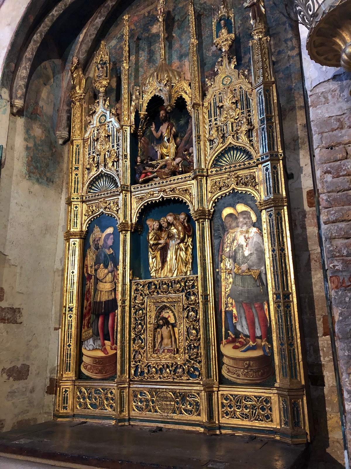
Below the chapel is a crypt and I went down to see it. Even in July, the floor was covered with water. When I asked the sacristan about it, he showed me photographs with the water up to the bottom of the arches, a stark reminder of the fragility of Venice.

Thursday, 8 November 2018

Art Institute of Chicago, Rachel Harrison, label

We were in Chicago last weekend and spent a day at the Art Institute. Wandering through the permanent collection, we came upon this sculpture by Rachel Harrison.


As always, wondering what it was about, we looked at the label. I was interested to learn that the work is one from a series of works named after prominent men; this one is titled Pablo Escobar, and the label reminded me that he was a famous drug lord.

As I wandered away, Tom started snorting at the label, and, of course, I read it again. As Tom said, the sculpture hardly seems a "biting critique of cultural representations and stereotypes," although its bright colors and souvenir ceramic ristra (a string of peppers) certainly are stereotypical Latin American tropes. Perhaps the label writer was suggesting that the sculpture calls attention to the stereotype of Latin Americans as liking bright colors and cheap souvenirs, and being drug dealers? It has taken me 5 days to come up with that explanation and that was only possible because I photographed the object and the label in response to Tom's disdain. Given the small number of words allowed for museum labels in some institutions, I wondered why the writer did not give a clearer explanation of Harrison's purpose rather than refer to the other  people depicted in the series. On one side of the sculpture is a shelf, where one would imagine the artist had placed something, but it is empty. The sculpture of Al Gore is a bright colored mass with a thermostat attached and that of Tiger Woods is a bright colored blob with a can of golf balls on a decorated pedestal. So those seem more playful than biting and not particularly stereotypical.
 I was amused that the ristra still has its sales tag. Oh, and by the way, the label says the figure "holds a bouquet," but I think the ristra is just attached to him. No hands.

Of course, having copied the label, I'm now wondering about another sentence: "Stubbornly physical yet highly conceptual, Harrison's sculptures evoke ancient memorials and reflect the influence of today's celebrity-centric culture." It's a nice-sounding sentence, but I wonder why her works are stubbornly physical, as opposed to just plain physical and why the writer seems to think that physical things aren't usually also conceptual. I don't see the evocation of ancient memorials beyond that naming a work after a person who is dead makes it a memorial, and I have no idea how  they "reflect the influence of today's celebrity-centric culture" except that the work is named after a person who is well-known (but not well-known enough that I could remember who he was).

I was struck by the size of the sculpture and like the way it evokes a human being without being very specific: the top suggests a tilted head, there are shoulders, a narrowed part that could be a waist, the shelf suggests buttocks, and the lower part could be slightly bent legs. The painted colors copy the colors of the peppers in the ceramic ristra, an object that can be found in shops carrying Mexican tchotchkes.

Here's the label:

Saturday, 24 February 2018

Pirandello on Things


In preparation for a trip to Sicily later this spring, I’ve been reading some books about the island and by Sicilians. One of them is The Late Mattia Pascal¸ an early novel by Luigi Pirandello. Today I came upon the following passage, which very clearly explains why it is so difficult to throw things away. I’m surprised that he thought and wrote this in 1904. Pirandello won the Nobel Prize for Literature in 1934.

“Every object is transformed within us according to the images it evokes, the sensations that cluster around it. To be sure, an object may please us for itself alone, for the pleasant feelings that a harmonious sight inspires in us, but far more often the pleasure that an object affords us does not derive from the object in itself. Our fantasy embellishes it, surrounding it, making it resplendent with images dear to us. Then we no longer see it for what it is, but animated by the images it arouses in us or by the things we associate with it. In short, what we love about the object is what we put in it of ourselves, the harmony established between it and us, the soul that it acquires only through us, a soul composed of our memories.”

(Luigi Pirandello, The Late Mattia Pascal, translated by William Weaver, 1964. Hygiene, Colorado: Eridanos Press, Inc. 1987, p. 100).


Tuesday, 6 February 2018

Jimmie Durham: At the Center of the World, Whitney Museum


I very much wanted to see the Jimmie Durham retrospective at the Whitney Museum. I’ve known about Jimmie Durham as an American Indian artist for at least 30 years and his relocation to Europe in the 1980s seemed a loss for the art world of the United States. No one I know has heard of him. I’ve seen his work occasionally in European museums, but it was a surprise that major museums in the United States would mount a show. There has been some controversy about his self-identification as American Indian, and that aspect of his work was not emphasized in the exhibition until near the end. That made sense because his work address many subjects and aspects of his identity.

Although I was eager to see the exhibition, I expected to be disappointed because I know Durham makes extensive use of found objects and thought I would see a lot of abstract constructions of detritus. In fact, I found the exhibition riveting, fascinating, touching, amusing, and both personal and universal. The first room captured me with a video of Durham hacking away at a chunk of obsidian, making an abstract sculpture from this very hard stone, used to make amazingly sharp tools in ancient Mexico.
Slash and Burn, 2007
Collection of Mima and Cesar Reyes


Slash and Burn, detail
The first object I looked at was this one, titled Slash and Burn, 2007, and the label provides very helpful context for the work: “While in residence at the Atelier Calder in the Loire Valley, Durham found a fallen beech tree in Strasbourg, France. Inspired by its physical traces of history – it had declarations of love carved into the bark as well as seven bullets from World War II embedded in it – Durham cut the tree into several planks, which he incorporated into a series of sculptures including this work. Fascinated by the patterns and holes created by insects and fungus growth, he chose to accentuate these natural phenomena by painting them with watercolor. As he has done in a number of other works throughout his career, here Durham includes text that directly addresses the viewer and describes his process of embellishing the beech tree.” The label, the text on the work, and Durham’s additions to the plank of wood all contribute to the depth of both personal (both his own and others), natural, and national history the slab evokes. It was difficult to move away from this very simple object.

Carnivalesque Shark in Venice, 2015, glass, goat leather, piranha teeth, papier-mache and acrylic paint
Collection of Eleanor Heyman Propp


Because we love Venice and collect glass, the second object, Carnivalesque Shark in Venice, 2015 also caught my attention, a glass shark with a painted carnival mask, which was simply amusing. 

The Dangers of Petrification, detail, 1998-2007


 Many of the works are gatherings of found objects with inscriptions that suggest political issues, artistic media, or Durham’s personal issues, often all at once, so that they have both broad and specific context. Sometimes the sculpture or panel composing several found objects was uninteresting until one read Durham’s descriptions of the items. For example, I found  The Dangers of Petrification, 1998-2007, two vitrines of rocks, labeled as petrified states of various unlikely items particularly amusing. The objects played with our assumptions about what things look like, as well as the idea of scientific collecting and categorizing. The rocks seemed possible as petrified everyday foods, but it took a particular kind of vision and imagination on the part of the artist to see them as petrified German black bread, chocolate cake, cheese, or bacon.
Malinche
Stedelijk Museum voor Actuele Kunst (SMAK), Ghent, Belgium

 Malinche, detail
In another gallery was a composite portrait labeled as La Malinche, the woman Cortez took up with in Mexico, considered the ancestor of mixed race Mexicans, mestizos. First planning it as an image of Pocahontas, Durham revised it and added figure representing Cortez. The face of La Malinche is remarkably expressive, considering the simple materials and abstracted style used to create it. A detail of it illustrates Holland Cotter's positive NY Times review of the exhibition, which also includes illustrations of many more works in the exhibition.

Wahya, 1984, detail. Bear Skull and more
Coll. of Luis H. Francia and Midori Yamamura


Wahya, 1984 detail of other side

Then there are the totem-like constructions employing animal skulls and various found objects. Looking at my photographs I was stunned by how completely different they are from each side, as well as how powerfully expressive they are.


I Will Try to Explain, 1970-2012
Private Collection, courtesy of kurimanzutto, Mexico City

 In several of the works, Durham’s inscriptions make them almost literary and certainly biographical, always in an unprepossessing mode. I Will Try to Explain, 2007-2012, a rather simple collage, caught me with the sentence involving the cat skin, but carried through with mention of friends, the struggle to make good art, and the history of the farmer, the cat, the object itself, and the artist. It’s almost like poetry.
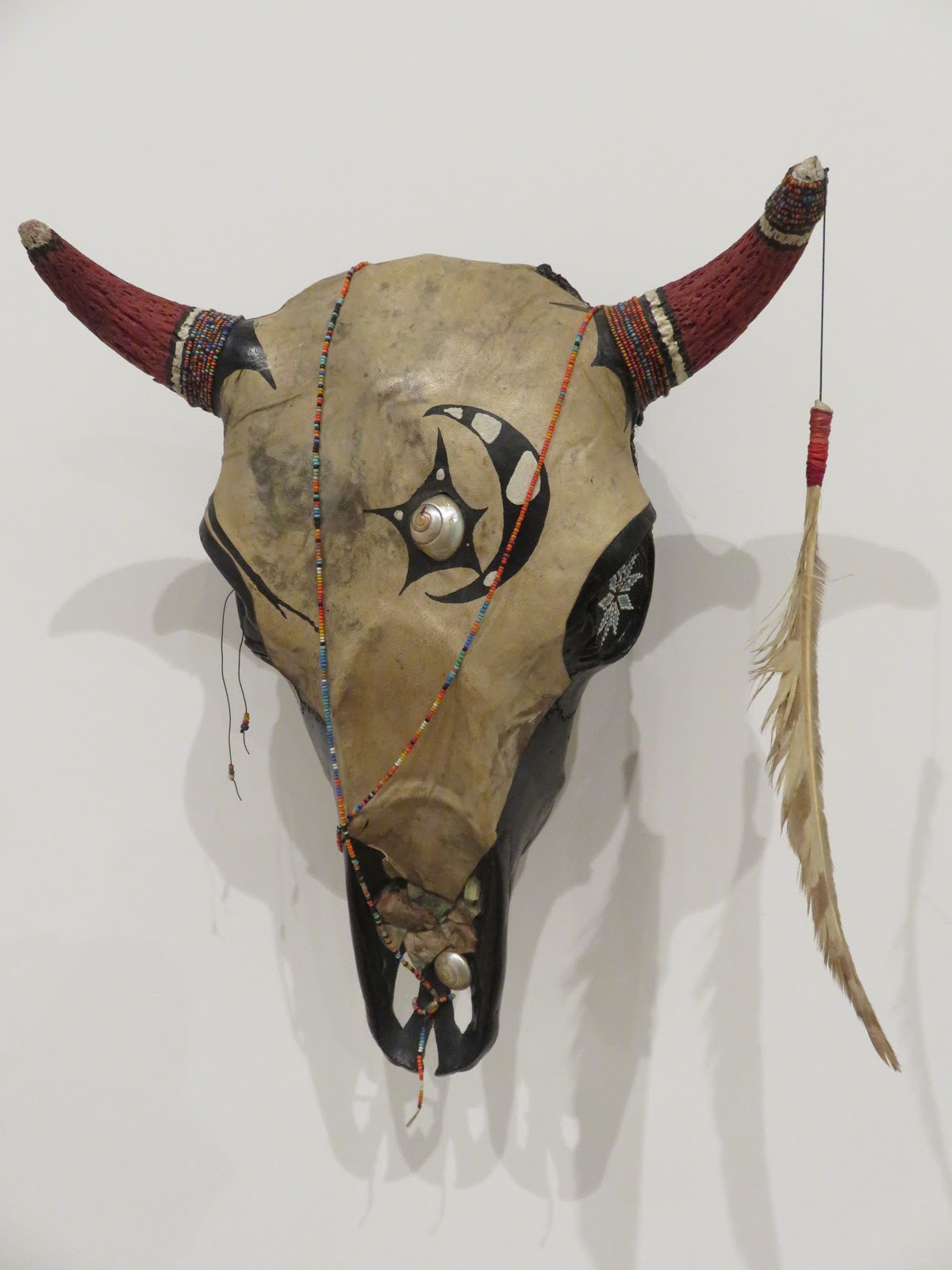
Untitled, 1982, baby buffalo skull, beads, goat leather, hawk feather, shells, acrylic paint
Collection Joe Overstreet and Corrine Jennings

 For many of the works the accompanying texts and the context provided by the labels add multiple dimensions to the already sculptural forms. One example is the single skull, remnant of a 1982 installation of  elaborated animal skulls, Manhattan Festival of the Dead, with texts urging the gallery visitor to purchase them for $5 each because the work of dead artists goes up in value and the artist is already approaching the life expectancy of an American Indian, and dedicating the works to the members of the American Indian Movement who were killed after the 1973 siege at Wounded Knee as well as to everyone in New York “killed by subways, .38 slugs, needles or desparate [sic] acts, without any proper ceremonies to help their passage and our passage.”


There is a particularly amusing self-portrait with identifying inscriptions, , 
from Six authentic things, 1989,  Real Obsidian (Private Collection)

Une etude des etoils, 1995
Collection of Herve Lebrun
and A Study of Stars, 1995. The little inscription above says "The Cherokee stars have seven points" in French. I particularly liked the computer key and the starleaf gum leaf.

At this point I realized that I had gone through the exhibition backwards.
.

Friday, 2 February 2018

January 2018 in New York, Wiener Werkstätte and Michelangelo


In five days in New York we visited eight museums, twenty-four exhibitions, four plays and the Santiago Calatrava transit hub at the World Trade Center.. We had lovely meals at the Pergola French Restaurant, The Blue Fin, and Sardi’s in the Theater District, Fig and Olive near the Whitney, and the restaurants at the Met, the Guggenheim, and the Neue Galerie, not to mention the friends who provided wonderful dinners for us. We did not spend any time in the permanent collections of any of the museums, due to lack of time, energy, and any compulsion to look again at art we have seen many times before. We expect there will be time for that later.

With so many exhibitions, I can hardly have delved deeply into any of them, but I did have responses to them all. Four were the keystones of the trip. They were Wiener Werkstätte 1903 to 1932: The Luxury of Beauty at the Neue Galerie, Michelangelo: Divine Draftsman and Designer at the Metropolitan, Jimmie Durham: At the Center of the World at the Whitney, and Josef Albers in Mexico at the Guggenheim. I love the designs of the Vienna Workshops, especially Josef Hoffman and Koloman Moser. A vitrine of brooches is spectacular, as well as the room full of earlier mostly silver objects. Although some of the objects designed by Dagobert Peche are lovely, I thought he weakened the coherent image of the movement by adding more floral components and making the objects larger and more colorful. As the workshop struggled to stay afloat by designing for manufacture rather than individual artisanship, the objects became more colorful and the designs seem looser. No photographs are allowed, so I can only link to the Neue Galerie website for images. A review in the New York Review of Books provides a few more images and discussion of the economic and architectural aspects of the works.

Not surprisingly on a Saturday, the Metropolitan was packed and it was almost impossible to see the Michelangelo drawings, definitely impossible to have a leisurely viewing. It made me wish the Met would charge full price for exhibitions, with pay-as-you-wish for general admission. The narrative of the exhibition is coherent and brings up a range of aspects of Michelangelo’s practice, for example drawings for and by students, collaborative works with Sebastiano del Piombo (the subject of a major exhibition at the London National Gallery last year, also with facsimiles used as educational materials), finished drawings for and of the people Michelangelo loved, drawings for paintings by Marcello Venusti, and portraits of the artist. Among the sculptures on view I was particularly taken by the small bronze by Michelangelo’s teacher Bertoldo di Giovanni, of Apollo playing his violin and turning in space, figura serpentinata before it was a thing. I don’t remember seeing drawings showing student copies of Michelangelo examples before and found those enlightening both for the objects themselves and for the sense they provided of the master in teaching mode. The exhibition suggested the degree to which Michelangelo collaborated with other artists, to some degree revising the idea of him as an isolated genius.

The facsimile of the Sistine Ceiling, one-quarter size, attracted considerable attention. I think more people photographed that than the drawings Michelangelo made for it. It was supposed to be helpful in locating the figures for which the drawings were made, but the small photographs included in the labels were probably easier to connect to the drawings. I suppose if you've never seen the actual ceiling, the facsimile is pretty impressive. The labels were helpful and clearer than most of those at the Met, relatively free of jargon, at least for me, but studded with adjectives – “bold, striking, ravishing, vigorous, impressive, forceful, remarkable, finely rendered, powerful, beautifully elaborated, elegant, active” for Michelangelo and “awkward, less subtle, wooly anatomy” for not-Michelangelo. I tend to argue with adjectives in labels and they distract me from experiencing the works of art on my own. I believe that people can figure out if an object is vigorous or ravishing or beautiful without being told.

While this was a most impressive gathering of a great number of Michelangelo works, most of them terrific examples of his drawing style, I wondered still about his working process. Did he produce only this small number of drawings for the Sistine Ceiling or the Medici Tombs? Of course not, and it would have been fascinating to see more examples of how Michelangelo’s conception of figures evolved in the process of designing these monuments, and others. This is not to disparage the exhibition, which must have required near superhuman diplomacy and extraordinary funds to get the important loans on view. It’s the kind of thing that only monumental museums like the Met can mount.

A comparison between Michelangelo’s unfinished bust of Brutus (1539-40) and a finished bust of Julius Caesar (1512-14) by Andrea di Pietro di Marco Ferrucci calls the Ferrucci “delicately ornate,” setting up a contrast with the far more muscular, bulked up unfinished face of Brutus. Caesar is approximately life-size, while Brutus is about double life size and on a much higher pedestal, accentuating the curatorial position that the Ferrucci is an inferior work. I found the Ferrucci extremely touching in its expression of thoughtful honesty, and the figure seemed aristocratic as opposed to the rougher aspect of the Brutus. As the label observes, Ferrucci’s mastery of marble carving served him, and Michelangelo, well when he was “head of the workshop in San Lorenzo in 1524.” The sculpture of Julius Caesar is a pretty wonderful object, beautifully executed and not all that much more “delicately ornate” than Michelangelo works closer to it in date, such as the St. Peter’s Pietá and the Bruges Madonna.  
Michelangelo, Brutus, 1539-40, detail (Florence, Bargello)

Michelangelo, Brutus, 1539-40, detail (Florence, Bargello)

Andrea di Pietro di Marco Ferrucci, Julius Caesar, 1512-14 (New York, Metropolitan Museum)

Andrea di Pietro di Marco Ferrucci, Julius Caesar, 1512-14, detail (New York, Metropolitan Museum)


Saturday, 7 October 2017

Venice Biennale National pavilions at the Arsenale and offsite

Once we had finished slogging through the national pavilions and first sections of the Viva Arte Viva at the Giardini and Viva Arte Viva at the Arsenale, we still had some 23 national pavilions at the Arsenale and what we could see of the national pavilions tucked away in palaces, apartments, and other venues around Venice. We only got to ¼ of the 32 off-site pavilions. On the way to the Arsenale from our hotel is a building that always houses one of these. This year it was Cyprus and the subject was pigment. Unfortunately, my images do not convey the subtlety of color in the nearly abstract canvases on view there, works by Polys Peslikas (b. 1973 Limossol, Cyprus, lives in Berlin and Nicosia).
Polys Peslikas

At the Arsenal, I was at first put off by the New Zealand offering of a very long panoramic animated history that started with images that reminded me of the movie “Moana,” which I had just watched on the airplane. Then as the Europeans arrived, it seemed likely to erupt in conflict, but it didn’t and we left well before the end, again our impatience with time-based art manifesting itself. In retrospect, it seemed a contemporary version of the historical painted panoramas that were popular in the 19th century in Europe and the United States, the history gradually emerging on a very long screen.
  

The Italian pavilion was completely different from its previous two iterations, focusing on only three artists rather than the dozens we’d seen there before, and titled Il Mondo Magico, (The Magic World). One installation created a sort of tunnel of translucent material, with side passages that led to little rooms with cadaver-like sculptures on tables. At the end of the tunnel was a workshop, where the figures were supposedly made, and a wall with many figures hanging against it. It felt rather creepy, something about death, degeneration, maybe crucifixion, since some of the forms were posed as if taken from a cross. The artist’s statement, by Roberto Cuoghi (b. Modena 1973) calls it a factory for turning out devotional figures.
Roberto Cuoghi 
Another space was a large substructure, which I didn’t understand; it looked like some kind of warehouse, bare metal columns and wood. At the end was a bleacher-like set of stairs we were encouraged to climb. It was quite dark. From the top one looked back and saw that the substructure supports a reflecting pool that provides a mirror image of the vaulted roof of the building. The effect is something like an infinity pool and a bit disconcerting and pretty cool, but reminded me of other similar water illusions I’ve seen. My main memory is of my own unsteadiness going down the stairs, which must be traversed at an angle, and of some concern that the heavy water would break the substructure. The label explains that the artist, Giorgio Andreotta Calo, intended the substructure to be read as a church and the upper area to refer to something called the mundus Cereris, a mythical pit near Rome that served as a door between the underworld and heaven. The work is titled Sensa titolo (La fine del mondo)
Giorgio Andreotta Calo, Sensa titolo (La fine del mondo)

Years ago, when the Chinese first had a pavilion in the Arsenale, it was in a space filled with huge drums, a dark place with relatively narrow passageways between the drums. Creating art for that space was an interesting challenge. Now all but one of the drums (symbolic of the past, I assume) are gone and the pavilion is light and spacious with white walls. And the art seems more ordinary as a result. Several artists were included and it was not very easy to distinguish who had done which objects. The guide indicates that the pavilion combines folk crafts with contemporary artists. There was an investigation by Wang Tianwen of the concept of shadow puppets, including very intricately cut sculptural forms suspended from the ceiling - one of these was also on view outside the gallery - plus shadow puppet contraptions. Large videos, I think by Tang Nannan, of things happening in the sea caught my attention. I never really figured out what they were about but found the scale of the images memorable.
Wang Tianwen
Tang Nannan video, showing scale
We used to hunt for the Mexico pavilion when it was located in a palace or church somewhere in Venice. For the past couple of Biennales, Mexico has had a relatively small space in the Arsenale and its offerings have been less intriguing to us. Perhaps the act of hunting for the pavilion increased its previous interest. In this case Carlos Amorales had created his own alphabet in order to tell a story of the lynching of an immigrant in Mexico. At least that’s what the label says. I was unable to make anything of the letters, so the label seemed to define the conceptual artwork.

Speaking of immigration, a video of Alec Baldwin and Julianne Moore caught my attention for a surprisingly long time. Eventually I ascertained that they were speaking the first-person experiences of various migrants crossing the Mediterranean, and I was surprised that my response to their reports of the experiences were more moving to me than the reports given by the actual immigrants, which appeared on videos in the next room. It’s mortifying but informative to realize how one responds to “the other,” as opposed to one’s “own kind.”  Titled “Love Story,” by Candice Breitz, (b. Johannesburg, 1972), it was an extremely effective work of political art, at the South Africa Pavilion, in the Arsenale.
Julianne Moore in "Love Story" by Candice Breitz

      Not far from Piazza San Marco were a small group of particularly effective spaces, in various parts of a small palazzo. In the palazzo courtyard, the path to the Mongolian Pavilion was lined with birds, cranes, actually, bronze sculptures cast as if from rifles by Chimeddorj Shagdarjav (b. 1954).  The flock, I Am a Bird, increases inside the pavilion, for a total of 60.  Cranes represent happiness and eternal youth in Asia, and the concept of the beautiful and graceful birds suggests an alternative to guns. Another Mongolian sculptural project, Karma of Eating, by Munkkh Munkhbolor-Ganbold (b. 1983)  is a kind of shamanistic gathering of the skulls of a few of the millions of animals that died in exceptionally cold winters and droughts in 2010, a disaster exacerbated by the overbreeding of goats for the cashmere business. The other three projects also address environmental degradation and exploitation.
Chimeddorj Shagdarjav, I Am a Bird

Munkkh Munkhbolor-Ganbold,  Karma of Eating

Nearby, the Mauritius pavilion proclaimed a dialogue among international artists, including work by Robert Rauschenberg, on the principle that it recreated the Edenic unity of the prehistoric Gondwanaland, one of the prehistoric supercontinents, which contained most of the southern hemisphere land mass. Traces of the continent were recently found under Mauritius. The Rauschenbergs were wonderful, better than much of the recent Rauschenberg retrospective at the Tate and MOMA. Of the other artists, I was most struck by the day-glo abstract utopian visions of SEO (b. Gwangju, Korea, 1977).
One of my very favorite pavilions was that of Andorra. Titled Murmuri, and by the ceramicist Eve Ariza, the room had black walls covered with hundreds of ceramic vessels ranging in color from black through brown and cream. The attendant explained that the vessels were the colors of human skin and that each of the vessels makes a sound if you listen quietly, i.e. they murmur, as the title suggests. Looking more closely, the bowls are crimped at the bottom, making a form that suggests lips. If I had one pavilion to recommend in Venice, this would be it.


Murmuri, detail