Wednesday, 27 January 2010
Barn renovation begins
Friday, 22 January 2010
Klee, Kandinsky, Bauhaus, Gabriel Orozco
The Kandinsky exhibition is huge and gorgeous. I love early Kandinskys and was sorry to see so few of them in the show. By the time we got about halfway up the ramp, we were starting to tire and the groups of abstractions from the same period were more than we really wanted to look at. Every once in a while a painting struck us, for example, when he changed styles. The didactic information was helpful, particularly the biographical outlines, but it also made us want more detail. Giving information in this way probably gets people to buy catalogues. We had already visited the Bauhaus show when we saw Kandinsky, so the confirmation of Klee's influence was reassuring. At some point, the thoroughness of such a huge exhibition is hard on the general viewer.
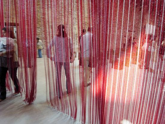
It was a relief to stop off at the huge room displaying the recently acquired gold curtain by Felix Gonzales Torres, Untitled (Golden), 1995 and one half of Roni Horn's Gold Field, 1980-82 in a large open room. The two works commemorate a connection between these artists as Gonzales Torres responded to Horn's work and subsequently made this curtain. We saw another of Gonzales Torres curtains in the Francois Pinault collection at the restored Dogana in Venice last summer. That one was red and suggested multiple aspects of blood at the same time it just divided a room. These curtains are lovely objects, sparkling in the light, rich with color, and inviting interaction, so they are both tactile and visual. It was cool that the Guggenheim decided to re-view the dialogue between the two artists. In one spot of the Horn the gold curves over itself and the reflection there is luminous orange, almost like fire. In the Roni Horn show at the Whitney a couple of days later, we were able to see the other half of "Gold Field" among some other paired floor objects. Somehow, knowing about the other half up the street with the Gonzales Torres made the Whitney sheet more evocative, as I looked for, and found, the flash of orange under the flap of gold.
On the theme of connections, I need to add something about the Gabriel Orozco retrospective at the Museum of Modern Art. Its centerpiece is certainly the grey whale skeleton Orozco and his crew dug up from a beach in Baja, then covered with extensive pencil lines. Installed in the huge atrium of MOMA, it actually looks a little smaller than I'd expected, but it's still impressive. I suppose one could think about the mortality of even the largest creatures, or the fragility of the environment, or any number of other meanings for the work. Mainly, though, it was big.
The whale was made for a library in Mexico and Lee Rosenbaum (Culture Grrl) made a great comparison of it to the whole whale at the Museum of Natural History. Coincidentally, we went to the "Shamu" show three times at Orlando's Sea World in January, watching live black-and-white killer whales do amazing things with their young and athletic human co-stars.
Another work, a recent MOMA acquisition, is Orozco's series of computer-generated prints, Samurai Tree Invariants (2006), starting with "a fixed arrangement of adjacent circles on a square background in a restricted palette of blue, red, white, and yellow." He varied the designs, starting at the center, by shifting the color based on the way a knight moves on a chess board: one space in one direction, two spaces perpendicular to the first, resulting in 672 variations. While most critics seem to have hated these works, I found them fascinating. I could not follow the chess-board color changes, but loved the variants they created.
The main body of the show had all kinds of stuff, recreating some controversial shows that left Tom completely uninterested, but then adding some works he liked a lot. He hated the empty shoe box on the floor and the gallery with one plastic yogurt lid on each wall. The yogurt lids look like simple blue circles from a distance and in that they seem to belong to minimal art. While I know it would be possible to write pages about the simplicity, the use of found objects, the emptiness of the walls as they reflect contemporary culture and art, I suspect that there is more creativity in what has been written about this installation than one can actually experience in it.
Tom liked the Citroen with its middle cut out and the multi-wheeled sculpture made of several bicycles. One work involved Orozco photographing his own yellow motorcycle next to identical ones he found parked on the street – interesting in a way as he found pairings, visually kind of neat, but maybe boring too. I liked the skull with a checkerboard pattern drawn on it (The Seventh Seal condensed into one object). And as a sucker for cute, I loved the photograph of a pile of watermelons in a grocery store with a can of cat food, cat facing out, on top of each (Cats and Watermelons, 1992). It looked like a totally impromptu juxtapostion (vegetable bins in the background), an unlikely combination, visually coherent, and without any special meaning, although I suppose someone could talk about consumerism and issues of nature.
What surprised me were the multiple connections between Orozco's work and the Bauhaus show next door. Orozco's large chess board with only knights seemed a response to the designer Bauhaus chess boards. His many geometric paintings, similar to the Samurai Tree Invariants, would have fit right in at the Bauhaus. The Bauhaus sparseness and clean lines seem reflected in much of what Orozco does today. I wonder if the Modern curators had thought about these associations between the two shows or if others have noticed them.
Thursday, 21 January 2010
Starting Apple Pruning
I pruned about six trees yesterday, in various parts of the orchard, trying to leave branches on the ground in several places so the rabbits would chew on them instead of the tree trunks. Today I went back and completed one full row, about 12 trees. Both days it has been cold, cloudy and damp, actually pretty good pruning weather. We bought new pruning clippers last summer at the Rotary International Convention in Birmingham, England. We thought it odd that farm implements would be on sale there, but they looked good and sturdy, so we got them. They seem to be working pretty well.
Rosie and Thunder were out with me and yesterday she went nuts, as usual, chasing the prunes and shaking them as hard as she could till they broke into pieces. Afterward her sore left leg was hurting so much she couldn't go down stairs. So today I tried to keep her calm and didn't toss her many sticks. She decided it was a good day for mole hunting and was digging around the trees with great determination. I watched her catch and eat two moles. She pretty much swallows them whole, must have an incredible digestive system.
We've had a lot of moles for a couple of years and I'm used to walking on soft places around the orchard. But in the snow they apparently didn't find it necessary, or possible, to burrow. They sort of plowed tracks through the grass, so since the snow disappeared we have little muddy mazes all over the farm. Maybe it makes it easier for Rosie to find them. Here's a sample of one of their tracks in the dry grass:
Meanwhile, Thunder barked at the horse, had a wild running spree through the orchard, and helped Rosie by blocking the mole hole so it couldn't escape. Champagne ate her oats with enthusiasm.
Wednesday, 6 January 2010
American Design and William T. Wiley
The Renwick Gallery had its Crafts Invitationals, showing four design artists, and a new acquisition in the Gallery caught my eye. Since I can usually photograph permanent collection objects, the new work is here. It is Karen LaMonte (b. New York City, 1967, resides Prague, Czech Republic), Reclining Dress Impression with Drapery, 2009, glass, Gift of the James Renwick Alliance and Colleen and John Kotelly. A life-size cast glass form that suggests the enclosed figure in some detail (note the nipples and muscles in the torso), but is hollow, is impressive technically and visually evocative. Its monumentality suggests the Parthenon reliefs to me, although the label calls it "more playful than political; frilly straps and a firm hip exaggerate the femininity of a woman conspicuously absent." LaMonte studied glass casting in Prague; after months of mold making works like this one take 40 days to cool.
Of the four artists exhibited, I guess I was amused by Mark Newport's knit costumes and a video of him knitting to the William Tell Overture. The ceramic artist Christyl Boger's glazed white (but also a bit beige) earthenware nude figures, some with gold luster decoration, and each with an inflated pool toy, suggest oversize 18th century porcelains updated. The pool toys in a sense seem analogous to the baskets of flowers or cute animals the 18th-century figures carry, symbols of leisure and pleasure. Appropriately, the figures are expressionless and a bit vapid, lovely bodies with not much worthwhile to do. That's what I thought till I read the label: "Overall the characters exude vulnerability. Their vacant facial expressions suggest introspection or self-involvement. Lost in their interior dialogues, they seem ill-equipped to cope with the reality that surrounds them. They give the impression they are uncomfortable with themselves and their environment and their discomfort extends to the viewer." I don't know who writes these labels, but this one seems to be working out some issues through these sculptures, or perhaps the writer misinterpreted what the artist says about her work.
The New York Times had a very good review of the William T. Wiley (What's It All Mean: William T. Wiley in Retrospect) show at the Smithsonian American Art Museum, recognizing his amazing facility with watercolor, his extensive use of text and puns, the combination of complex charcoal drawing and brash thick paint on his canvases, the fact that Wiley is not as celebrated today as he was in the 1970s, and the appropriateness of a contemporary reappraisal of his work. I would say he was still highly regarded and prized in the 1980s; that was when I helped purchase a painting for the museum at the University of Texas. When I arrived in the Kansas City area in 1988, Wiley was widely collected and exhibited here, and several of the notable works in the SAAM show are from Kansas City private collections. He showed regularly at the Morgan Gallery in Kansas City and came to Lawrence for the Lawrence Lithography Workshop. I was delighted to meet him at several of his Kansas City openings and other occasions. At one of them he sang a little song about Walt Disney and Mickey Mouse that made everyone laugh. At the next opening, a while later, he sang it again. And again the next time. After that I didn't go to his exhibitions any more. The Smithsonian exhibition includes a video loop of Wiley singing that song.
Wiley is a remarkable watercolorist, able to create dense mosaics of color in complex compositions. I'd always thought of him with a wry sense of humor; his Mr. Unnatural character seemed a parody of himself, not to take himself, or his work, too seriously. I used to enjoy hunting for the puns in the paintings and works on paper, cringing and laughing at them at the same time. Often his work was impossible to untangle, which made it more enticing. But the Smithsonian show focuses on the works that address social and political issues, referring to Wiley's anger and removing what I had always thought was a lightness about him (the Mickey song doesn't seem funny even the first time in the exhibition video). The 1982 sculpture "Boo Dada Bar BQ" captures that sense of humor, mocking California new-age Buddhists. Wandering through Wiley paintings, and often getting lost, one finds a little politics, a little literature and art history, some enigma, some great drawing and some powerful painting.
Washington, DC - December exhibitions
I had not been to the Phillips Collection since its 2006 expansion, so it was a surprise to see the new entrance and a bit of a puzzle to find the galleries and get oriented. Wandering through, I think I found most of the art, but it seemed that I was sneaking down little hallways and up and down little staircases to discover more rooms of art. Light, airy galleries house Washington School abstract paintings; the rest of the permanent collection looks quite lovely in the arcaded galleries upstairs. I had the idea to see the Man Ray exhibition there and then compare it to the Man Ray exhibition at the Jewish Museum in New York. However, we never got to the Jewish Museum, perhaps in part because I got a little bored in the Phillips show. Man Ray, African Art, and the Modernist Lens included a lot of Man Ray photographs of African objects, plus several of the objects he photographed and other photographers' images of them and other works. I understand that the thesis of the exhibition was that Man Ray's interest, and his photographs, effected the change in the understanding of these objects, from their being ethnographic specimens to being works of art in the Western sense. The Phillips' website explains it quite clearly. Nonetheless, the disjuncture between the photographs and the descriptions of the objects' purpose, and the display of the objects without real cultural context, became frustrating. I believe this is an important exhibition, but sadly, it seemed to reinforce the modernist and contemporary practice of separating African objects from their meaning at the same time it uses the photographs to increase our awareness of their beauty and abstract power.
Perhaps this is where I should mention the Yinka Shonibare MBE exhibition at the National Museum of African Art. Shonibare was born in Britain in 1962 and raised in Nigeria. His figures, figure tableaux, and videos of people in 18th-century-style dress made of brightly-colored and densely patterned cloth that is popular in Africa refer to European colonialism and its effects on Africa. While each composition is different - the figures do different things – the theme is always the same. The opening work in the exhibition is a sculpture based on Fragonard's painting The Swing at the Wallace Collection in London. I love the idea and appreciate that he embraces the sexual reference in the woman's shoe flying through the air. But the work would be so much stronger if he had left out the very fake plants that surround the swing. Perhaps his intent was to make the object look tacky; if so, he succeeds. Shonibare purchases much of the cloth for his costumes at Brixton Market in England; for some sculptures he commissioned fabric designs specifically related to the subject of the sculpture. For example, the headless man drinking from a water fountain wears clothing with plumbing designs. The variations in activities and number of actors did not significantly expand his view, to my mind. I had seen individual works by Shonibare in several exhibitions and was looking forward to the retrospective. Perhaps one Shonibare makes a strong visual impact and historical statement; several together may actually dilute that impact.
Also at the Phillips Collection I stumbled upon Intersections Art Projects, described on the Phillips' website as "intersections between old and new traditions, modern and contemporary art practices, and museum spaces and artistic interventions." Tayo Heuser had 3-dimensionally shaped canvases titled Pulse, apparently inspired by Mark Rothko's works in the museum, but in much softer colors and much more linear compositions, that were displayed on the walls of the main staircase. They are very pleasant to look at, abstract and tactile. A hand-drawn video by Jennifer Wen Ma, Brain Storm, of a person and a horse walking through an increasingly turbulent landscape, caught and kept my attention (very unusual for me), although I hardly noticed the images from it on the windows of the museum bridge. While the changing textures and shadows of the landscape were visually appealing, the steadfastness of the horse and man and their loneliness and togetherness kept me thinking. Finally, a wonderful string construction by Barbara Josephs Liotta, called Icarus, shaped and occupied space, had an elegant shape, and moved slightly with the currents of air in the gallery. It seemed to connect to other string compositions I've seen lately – the Tomas Saraceno at the Venice Biennale and a wonderful installation in the London Hayward Gallery's Walking in My Mind exhibition last summer, in which Japanese artist Chiaru Shiota stretched black cords across an entire room, leaving just a path for the viewer and some white shapes. And it makes me think of Fred Sandback (1943-2003), who made enormously evocative huge sculptures from single strands of yarn.
Sunday, 3 January 2010
Washington, DC, The Corcoran Gallery of Art
On December 16, on the way to see the exhibition Sargent and the Sea, I wandered into the Corcoran's exhibition of its own collection of 19th century American sculpture, which included some wonderful bronzes by Bessie Potter Vonnoh and Abastenia St. Leger Eberle (1878-1942), women artists who are known but not famous.
Not being particularly interested in Renoir, I decided to see what I could like in this painting and immediately found myself surprised at how much there was. I thought of comparing it to a photograph and found that the painting was far more interesting than a photographic image of the scene might have been. Of course, in Renoir's time the photograph would have been black and white, losing most of what is delicious about the painting. The colors of the sea, partly greenish and partly turquoise, capture the best that water can be. Blue infiltrates the green of the vegetation and pink colors the sea and the sky. The surface of the painting shows the textures of the individual brush strokes, which suggest the movement of a slight breeze in the trees and the flow of the tide. The work is both visual and tactile. Because the bushes are in the way, revealing only a bit of the water and covering the left part of the town, you feel like the image is captured on the fly, as you might glimpse it driving around the bay into town; at the same time he allows you to see enough to understand the entire view. The painting calls to mind the sensations of the seaside and summer as well as the pleasures of brushstrokes and color.
I did finally get to the Sargent exhibition, which was both informative and a bit disappointing. The publicity refers to more than 80 works in the show, but a great many of them are drawings and sketches of fishing villages, sailing and steamships, ports, and boats on water. These sketches evoke the young artist capturing what he sees in many media, but barely suggest his virtuoso paint handling. Many of the paintings are small and not many of them capture the froth and brilliant light of Sargent's later work. For some reason I expected that the exhibition would include some watercolors of Venice, but I guess the canals there are not strictly "sea," and watercolor was not a significant component of this exhibition. Many of the smaller works came from a private collection or collections and seemed to be recent discoveries; the exhibition provided a unique opportunity to see this group of objects together and a focused look at an aspect of Sargent's early work. A map at the entrance indicated the significant travels that Sargent made around Europe between 1874 and 1880 in order to complete all his sea-related pictures, to Nice, Marseilles, Genoa, Naples, Capri, Tangier, Spain, Beuzeval (France), Cancale and other villages on the Brittany coast.
The exhibition includes many studies for its centerpiece, Sargent's Setting Out to Fish, a masterpiece in the Corcoran collection that is shown next to another, smaller version, the Museum of Fine Arts, Boston's Fishing for Oysters at Cancale. Comparing the two works to each other and to the studies was entertaining and revealed how Sargent used sketches and modified his paintings depending on where he intended to show them. So, while on the one hand, the exhibition was visually a bit disappointing, on the other it provided a rather detailed look at the way Sargent approached a painting, the subjects that at least in part interested him in his early career, and the various media he used as he was developing as an artist. It was a good scholarly show and I would have found it particularly interesting in a university art museum context.
Washington, DC – History Museum
Tom was on an NEA panel in December, so I had the chance to go to museums while he worked for three and a half days. I spent a half day at the National Gallery and was surprised that there were so few people there. In fact, all the art museums were very quiet; the week before Christmas it appears that everyone in DC goes home. The following week we were in New York, where the museums were packed with holiday visitors and people home for vacation.
Most entertaining was a visit to the National Museum of American History, where my purpose was to see Keeping History: Plains Indian Ledger Drawings. This tiny display of about 15 drawings by American Indians - who were either imprisoned at Fort Marion in Florida or confined to one of the Indian schools at the end of the 19th century - included computer stations with helpful information about the individual drawings that mostly depicted battles or hunts. While a focus exhibition like this one, especially with good educational material, is often much more informative and pleasurable than a huge encyclopedic examination of a theme, in this case there were so few objects that I did not leave with the feeling of comprehending how these drawings functioned or what they really meant. The exhibition indicated that hundreds of drawings exist, and I wanted to see many more of them. The computer stations provided really helpful interpretation of individual drawings, explaining an animal floating in the sky (the name symbol of the figure below) and identifying various objects depicted. While the hunts and battles were invigorating, the photographs of the Indians who made the drawings while trapped in schools and prisons pointed out the sad circumstances in which the art was produced. Perhaps making ledger drawings gave the prisoners chance to escape mentally and embrace their distinguished history. A version of the exhibition is available online.
I was much more excited when I wandered into the display of the Star Spangled Banner, where crowds of adults and children were busy trying to fill out questionnaires about the exhibition, where I learned that the Francis Scott Key song only became the national anthem in 1931 and where the enormous flag itself (decreased from its original size of 30 by 42 feet by the owners cutting out sections to give as souvenirs) had a profound impact. The information on the maker of the flag, Mary Pickersgill (1776-1857) was enlightening; I had never thought of a person making this particular flag.
In another part of the museum an ordinary Woolworth's lunch counter from Greensboro, South Carolina called up the entire Civil Rights movement. In a history museum an everyday object with no special design qualities can have a powerful emotional impact because of the context in which it played a role. The flag is really big, but identifying it as the source of the national anthem adds enormously to its power. The lunch counter, symbolizing more recent history, reverberates in ways both painful and heroic.
Finally, I visited Julia Child's kitchen, where, with several other people my age, I watched videos of her making crepes Suzettes and baked Alaska and wondered how obsessive she must have been to have outlines on her peg board to be sure her copper pots would always be returned to their proper places. It was helpful to see the actual person after having had her transformed into Meryl Streep by the movie Julie and Julia.